A new feature for Lifesum
Adding a create your own meal plan feature to a habit-tracking app.
Overview
Lifesum is a habit-tracking self-care app that promotes healthy eating. Users set a goal and add meals, water intake, and physical activity while the app tracks nutrients and calories. The premium version provides access to personalized meal plans and allows users to create and save recipes, but there is no way for users to plan ahead their meals for the week.
Design an in-app planner for users to store self-created meal plans
Design a way to add the meal plans to the daily diary
Ensure the new feature is embedded seamlessly into the current design
Targets
My Role: UX designer, UI designer, User researcher
Platform: iOS
Tools: Figma, Miro
Users cannot create their own meal plans within the Lifesum app.
Sticking to a healthy diet can take some planning. Lifesum offers meal plans with pre-filled options that can be swapped for other Lifesum recipes and allows users to put the ingredients into a shopping list. By adding a create your own meal plan feature, users can plan their meals several days in advance without being limited to only a few options and from there create a shopping list of their own ingredients.
Problem
Process
Research
This competitive analysis served as a tool to familiarize me with products with similar features and identify industry innovation opportunities. Lifesum’s primary feature is the nutrition diary but these competitor apps are centered around meal planning. The challenge would be incorporating a meal planning system while highlighting the ability to track nutrition details.
Competitive analysis
It was necessary to determine how users currently plan their meals and the resources they may use before adding a custom meal plan feature to the Lifesum app.
User interviews
Target group:
People who are physically active
People who want to alter their body weight
People who have special diets
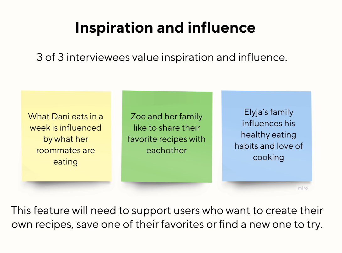
We asked 3 individuals from the target group (Dani, Zoe, and Elyja) about their meal planning habits and overall relationship with nutrition. The following themes emerged from their responses:
Define
Persona
Interview responses informed a persona
Demographics
Name: Kai
Age: 22
Occupation: Student
Bio
Kai has been vegetarian for the past two years and friends and family wonder if he is getting enough protein. He sometimes wonders as well but the idea of logging each food item seems tedious.
Kai enjoys cooking and eating healthy foods but has a hard time sticking to a routine with his busy class schedule. As a result, he finds himself eating out and making unhealthy choices leading to spoiled groceries and spending more money overall.
Recently, he has started a new workout routine and wants to be sure his diet supports his fitness goals.
Pains
- Checking food labels
- Stopping to log each food item
- High costs
- Wasting food
Wants/Needs
-Cook more and learn new recipes
- Quick and convenient meal planning
- Eat enough protein and calories
Save time and money
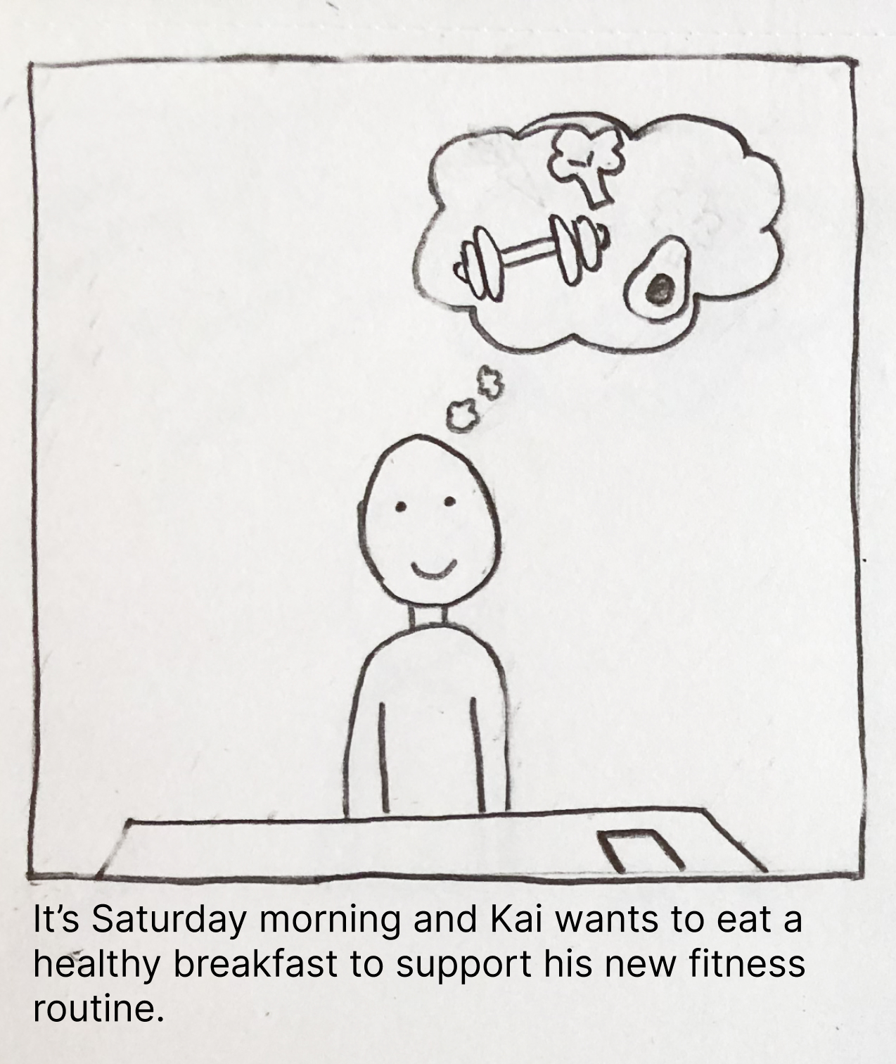
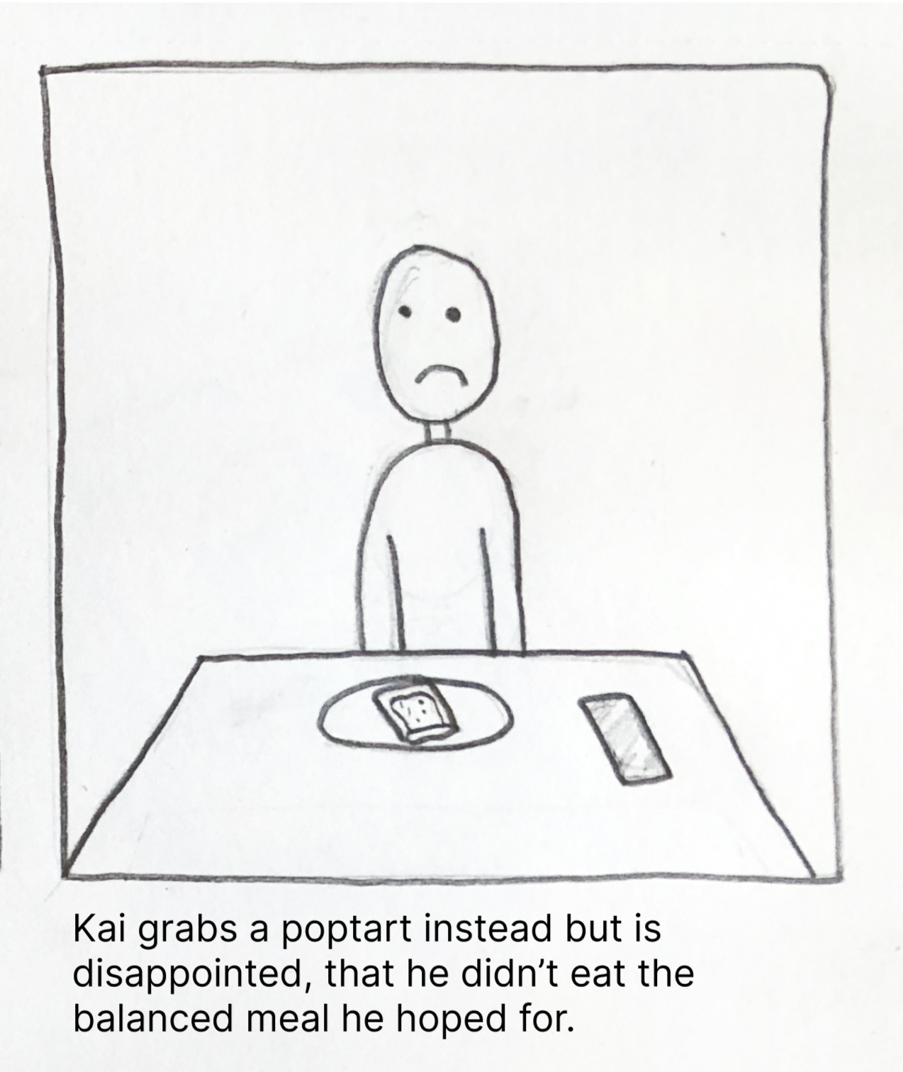
The persona Kai was placed on a storyboard to show how a user would interact with the app in the context of their own home. This informed the processes that would be laid out in future wireframes.
Storyboard
Context
Problem
Solution
Outcome
Ideate
Users prioritize convenience so adding a meal to the planner would need to be repeatable and done in 3 steps or fewer.
Task flow
Wireframes
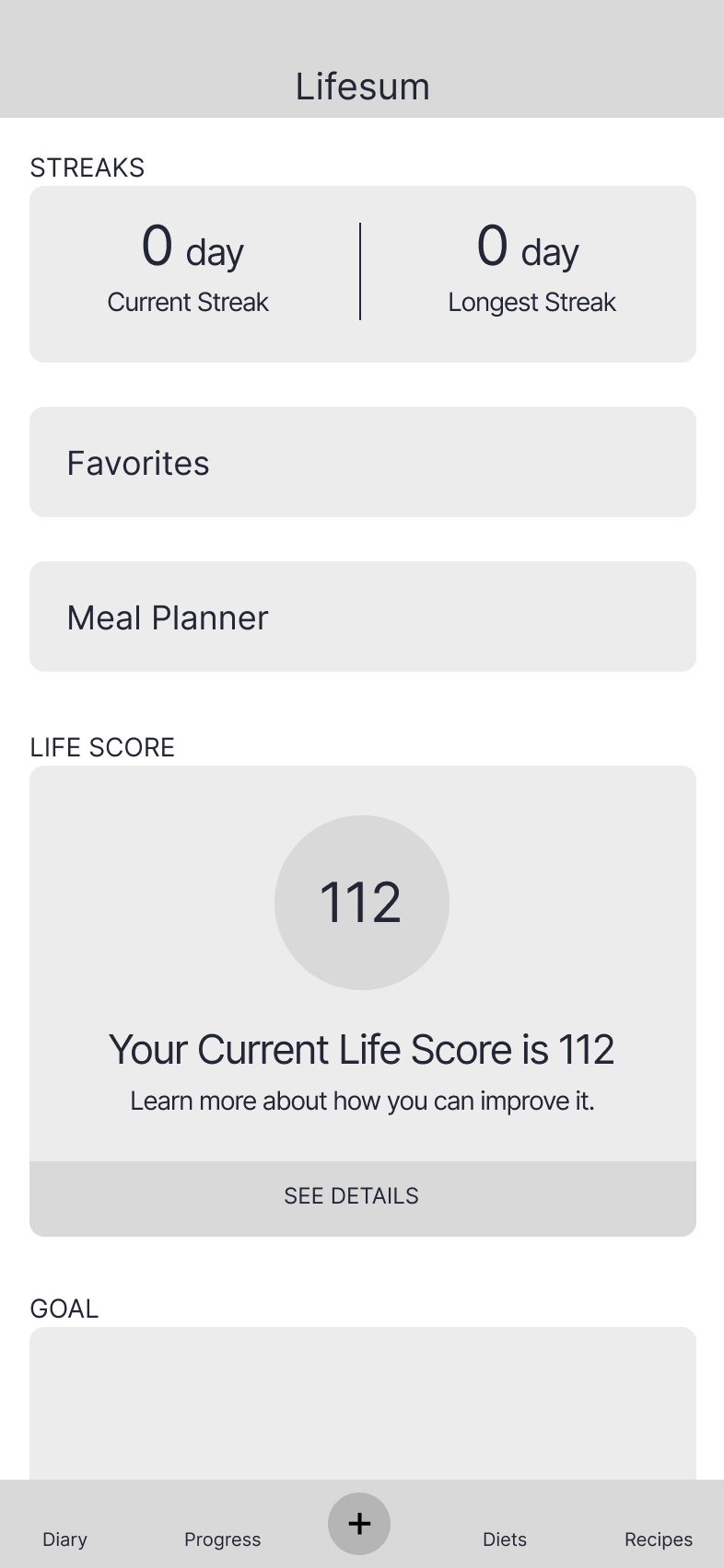
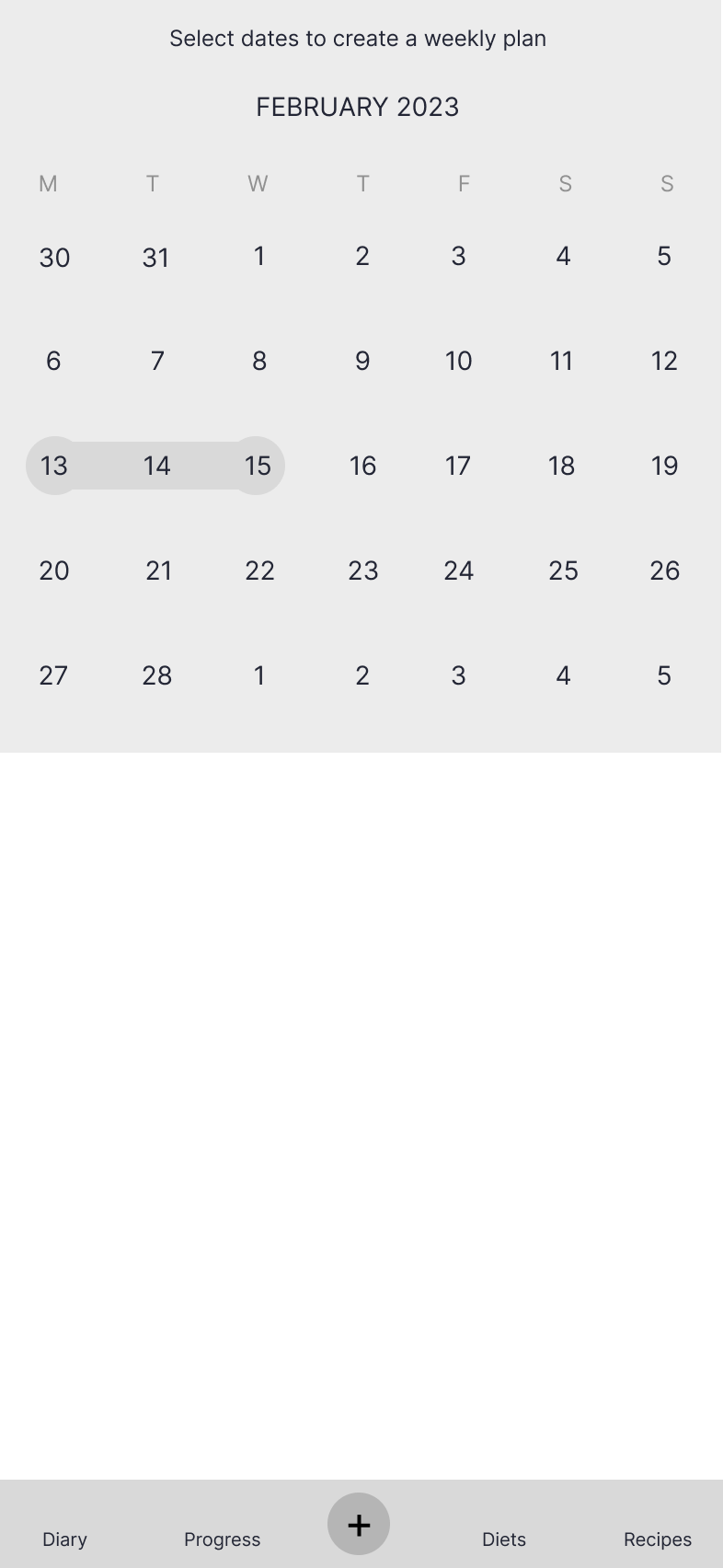
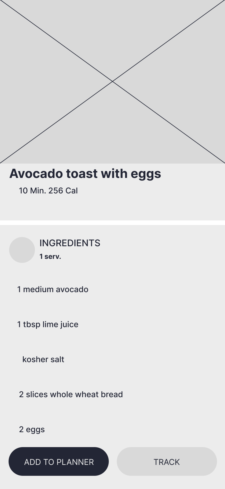
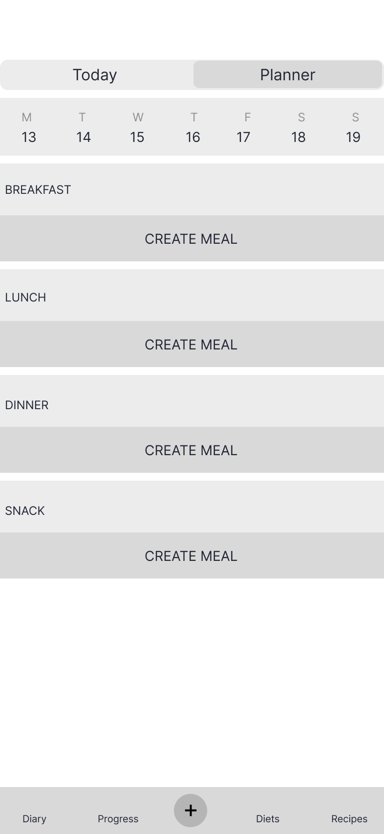
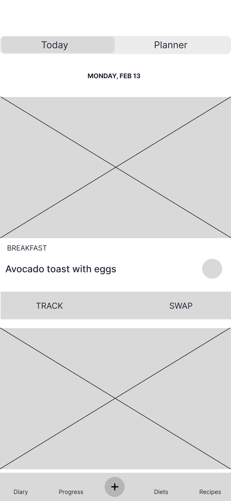
I created mid-fidelity wireframes that mirrored existing layouts within the app.
Progress page
Calendar: select dates
Add a meal from recipes
Start a meal plan
Weekly view: dates selected
Items added
Daily view: meals selected
Prototype: version 1
Existing UI elements from the Lifesum app were added to the wireframes to create a testable prototype.
Test
Usability tests were conducted to determine the usability of the added meal planner feature on the Lifesum app by the following criteria:
Users can select the dates they want to plan for.
Users can add a meal to their planner.
Users can navigate between the daily and weekly views.
Usability testing
This feature was tested by 3 participants between the ages of 23 and 24 who have varying levels of experience with meal planning.
Demographic
This feature was tested by 3 participants between the ages of 23 and 24 who have varying levels of experience with meal planning.
Methogology
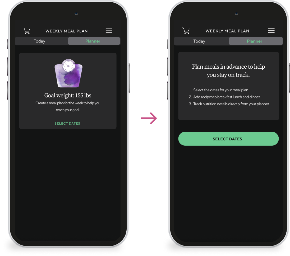
2 of 3 users did not choose the primary CTA select dates to begin creating their meal plan.
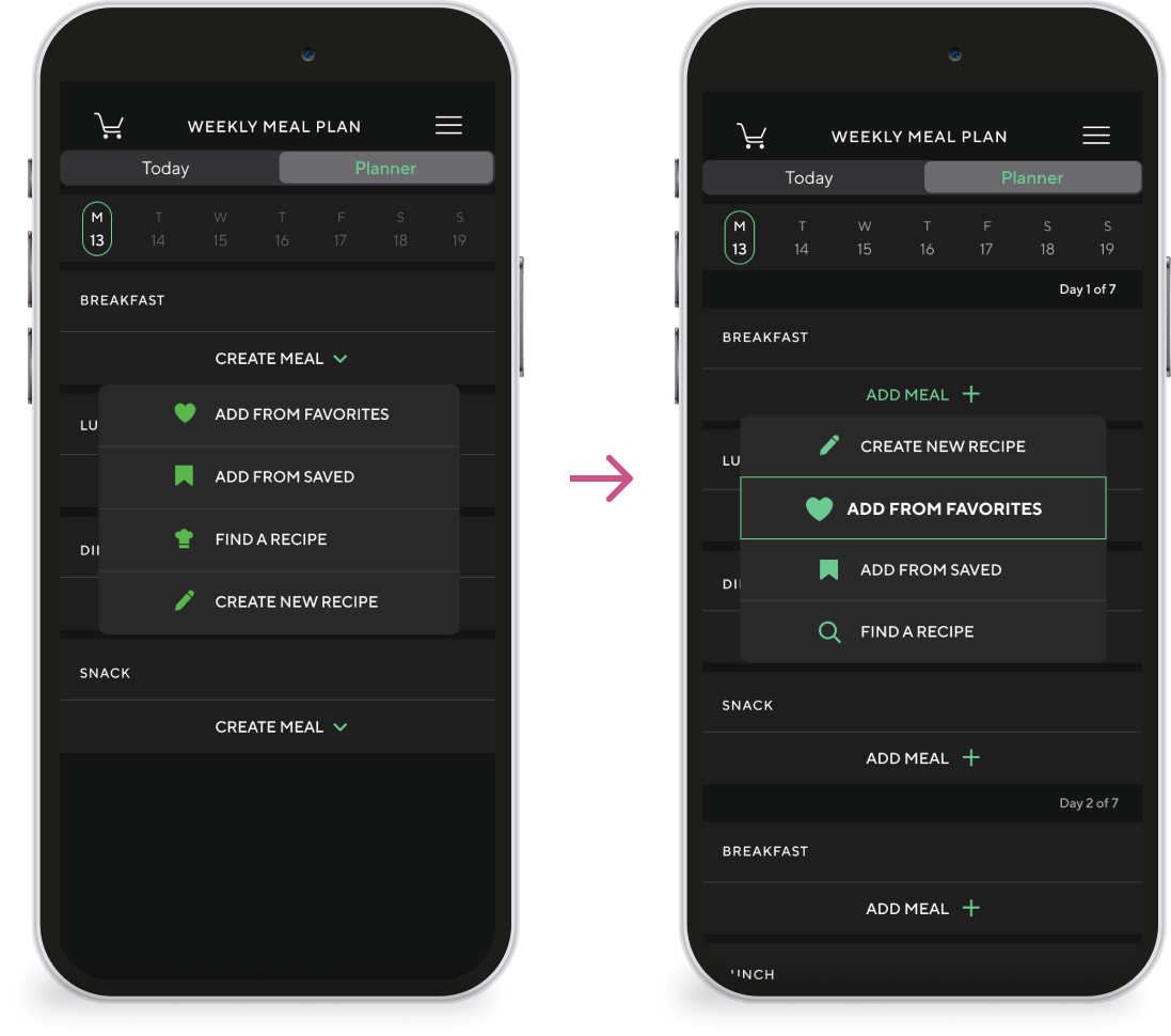
Users were asked to add a meal from their favorites to their planner but 2 of 3 users clicked create new recipe instead of favorites. When asked why, one user stated that they were using the app for the first time so they would have to create a recipe before favoriting one.
Observations
This prototype needed to be updated to improve its usability.
Iterate
What changed?
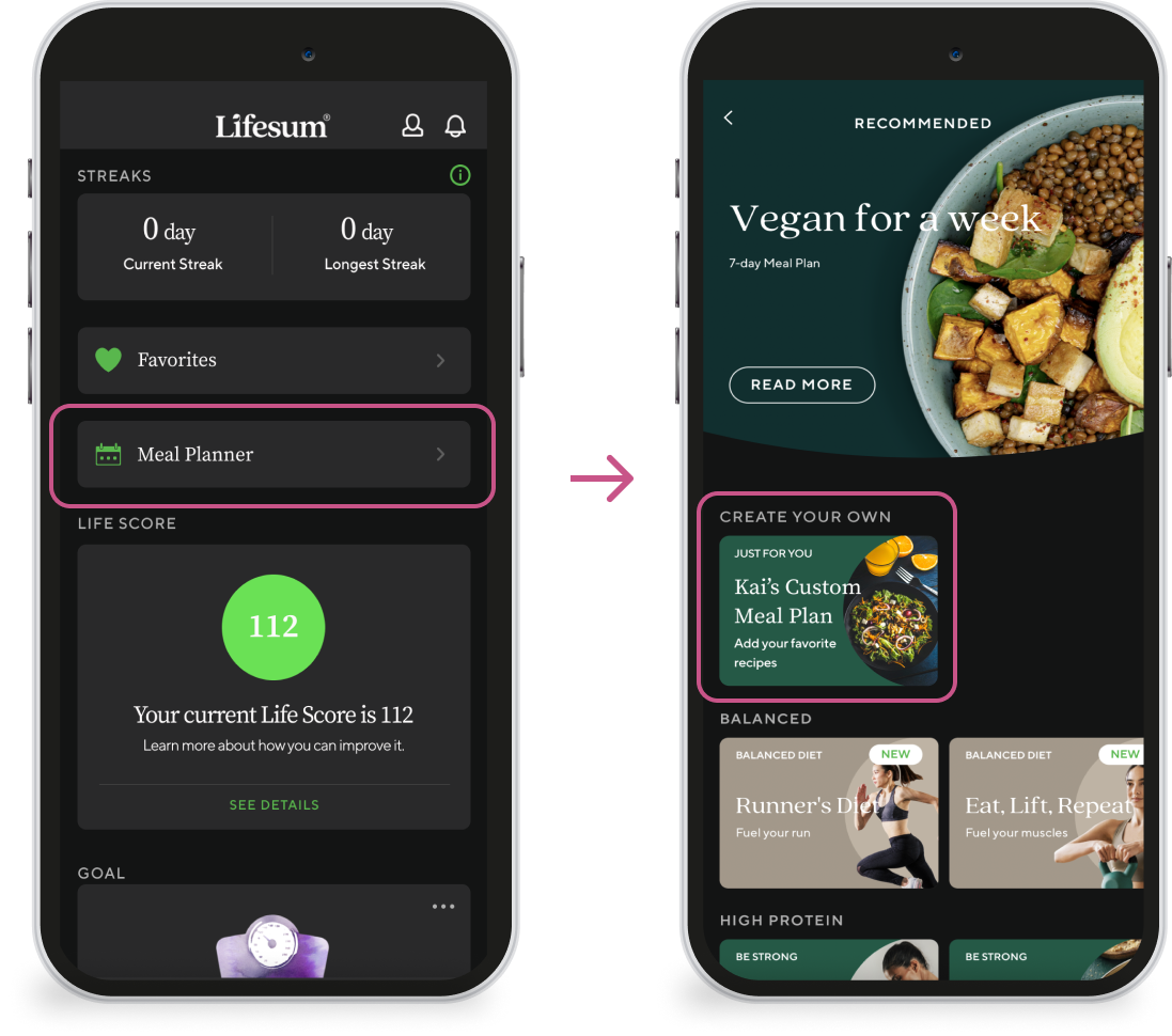
Replaced diets with planner, changed labels to all caps, and changed the track a meal icon from a + to a √.
Bottom navigation
Starting point
Access to meal planner moved from the progress tab to the planner tab
Create meal became add meal and the v was replaced with a + icon. Also, create new recipe was moved to the top of the list
Adding a meal
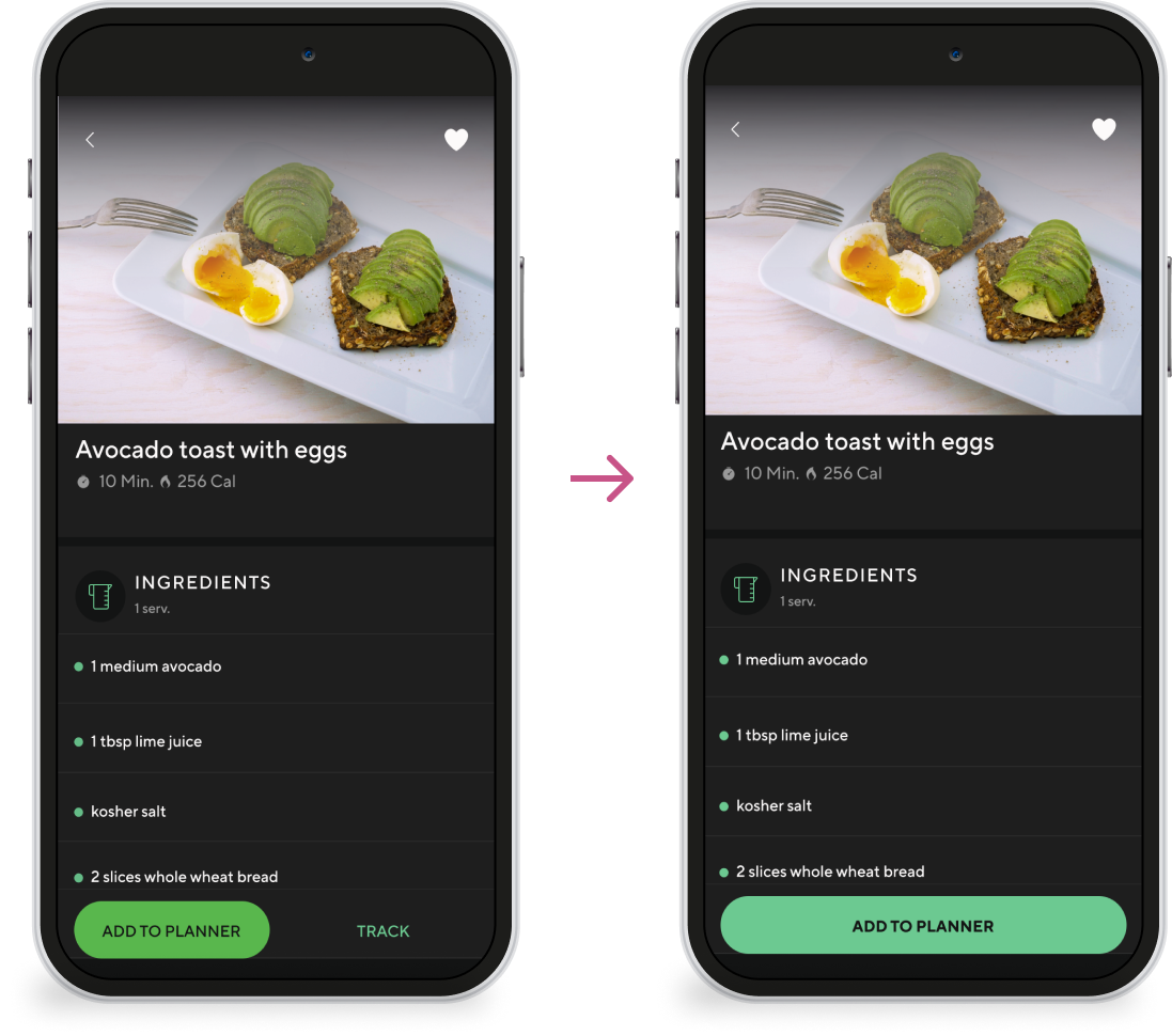
2 buttons to 1
Removed the option to track meal and extended the width of the add to planner button
The first step
Goal replaced with steps and the CTA button style was made more prominent
Copy guides users through the process and the added buttons allow users to navigate to the next step when they are ready
Selecting dates
Notifications
Users wanted to see notifications from the app
Accessibility
Color palette was condensed and contrast increased
Next steps
Adding a feature to an existing app presents the challenge of working within the constraints of the current design
The next steps are to...
further, adjust the UI to improve accessibility
Introduce the option to repeat meals
Conduct user testing on the most recent prototype


